STUDIO KER
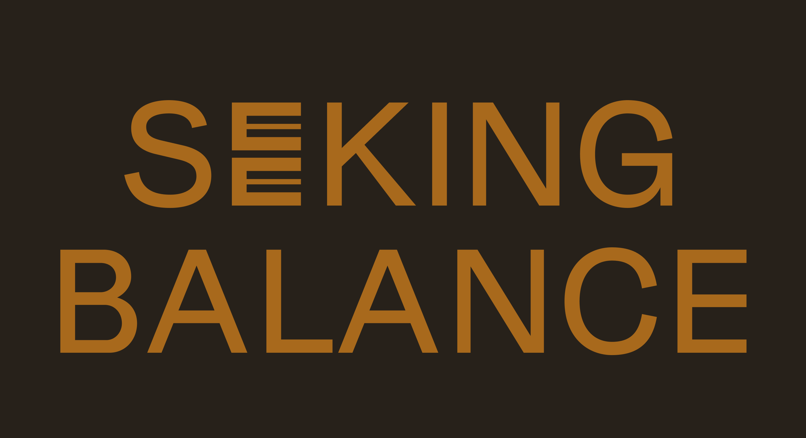
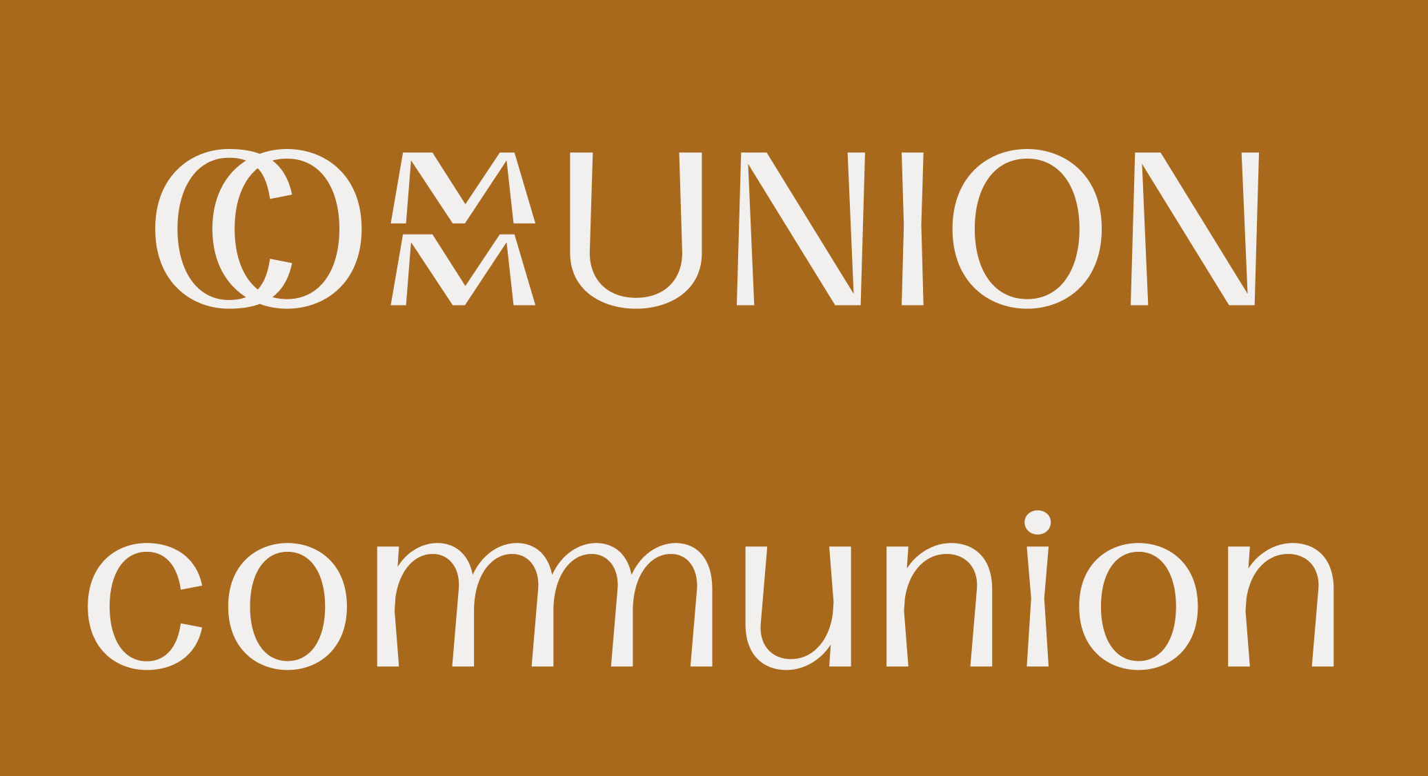
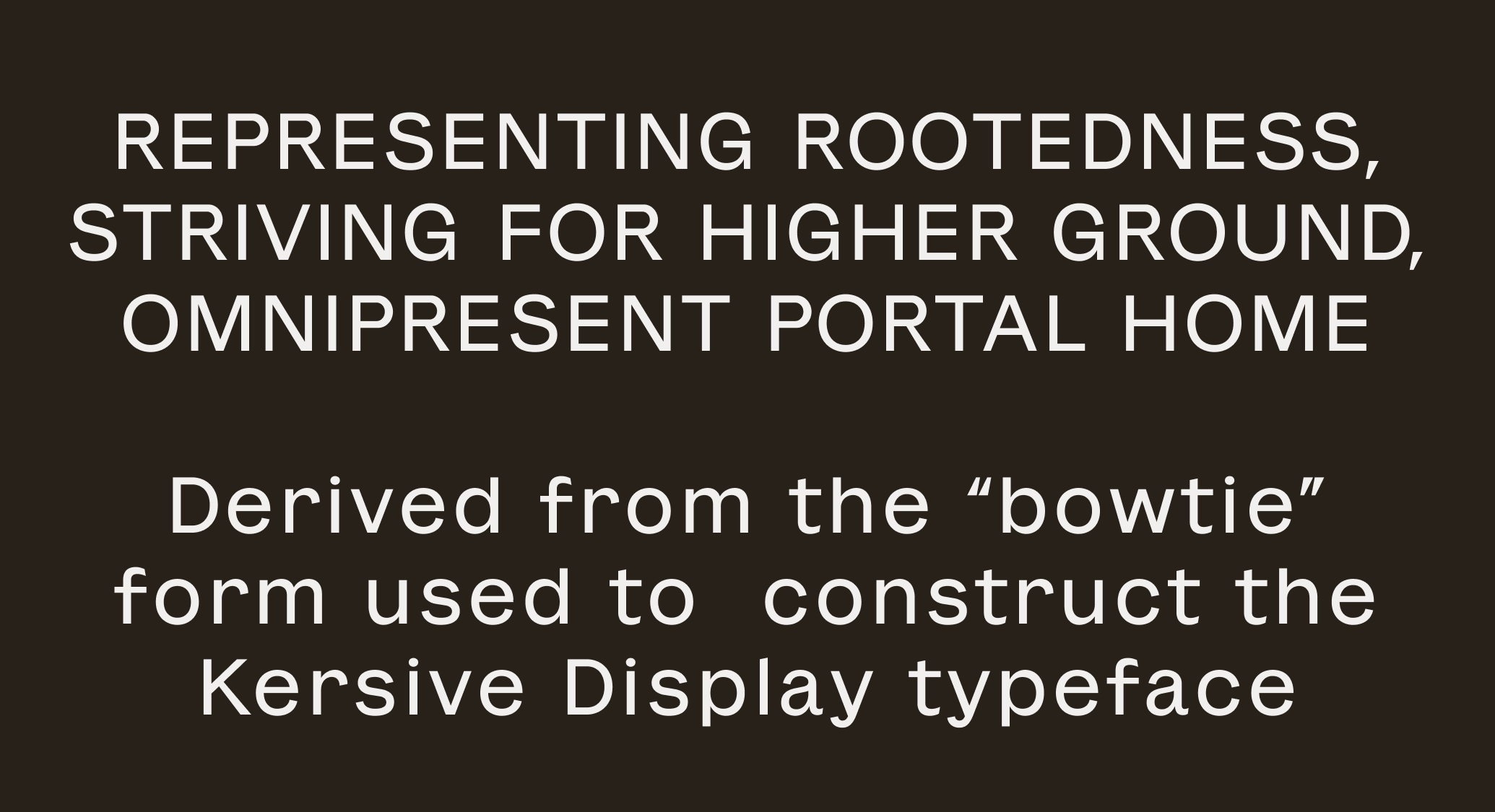
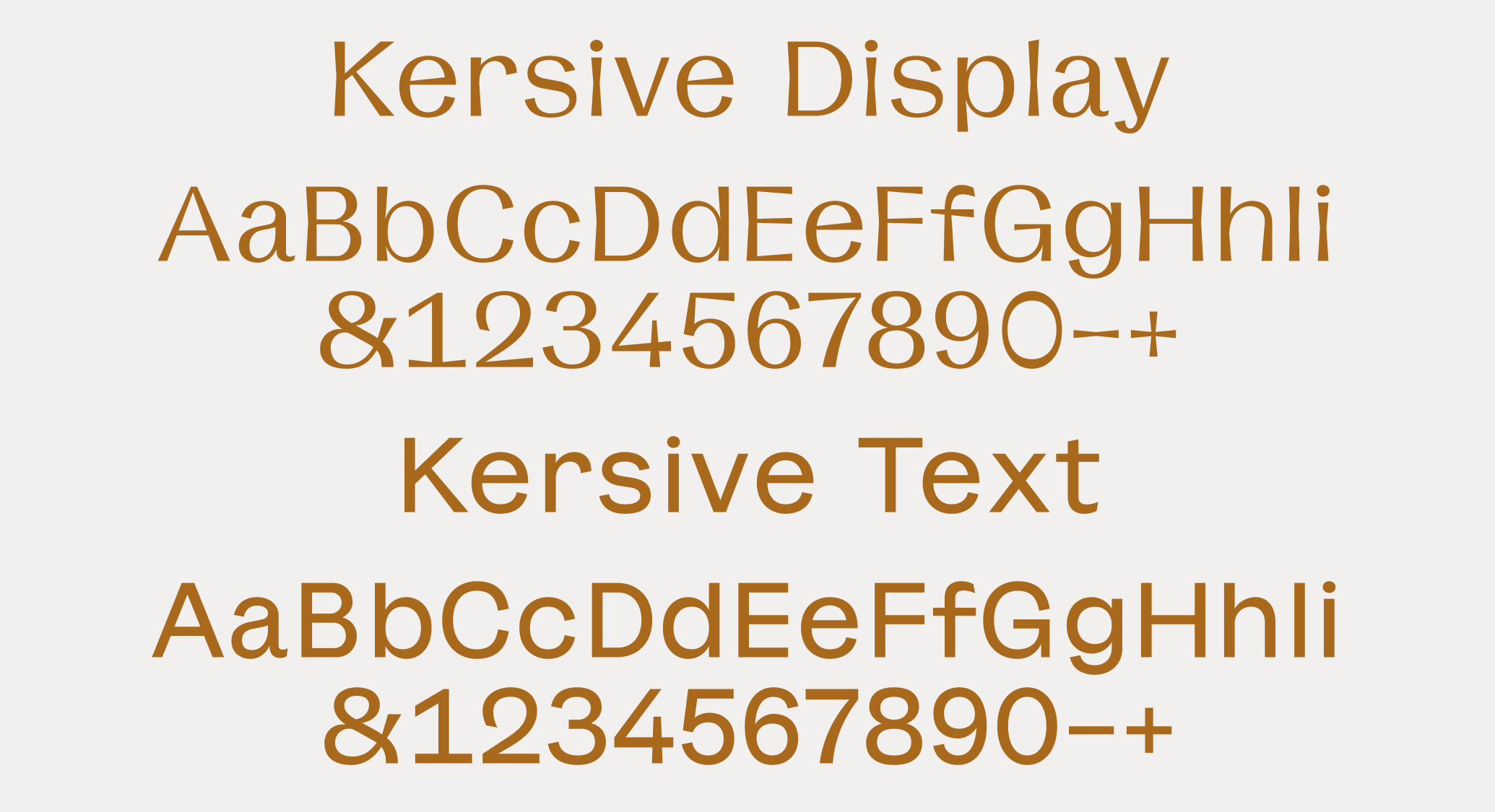
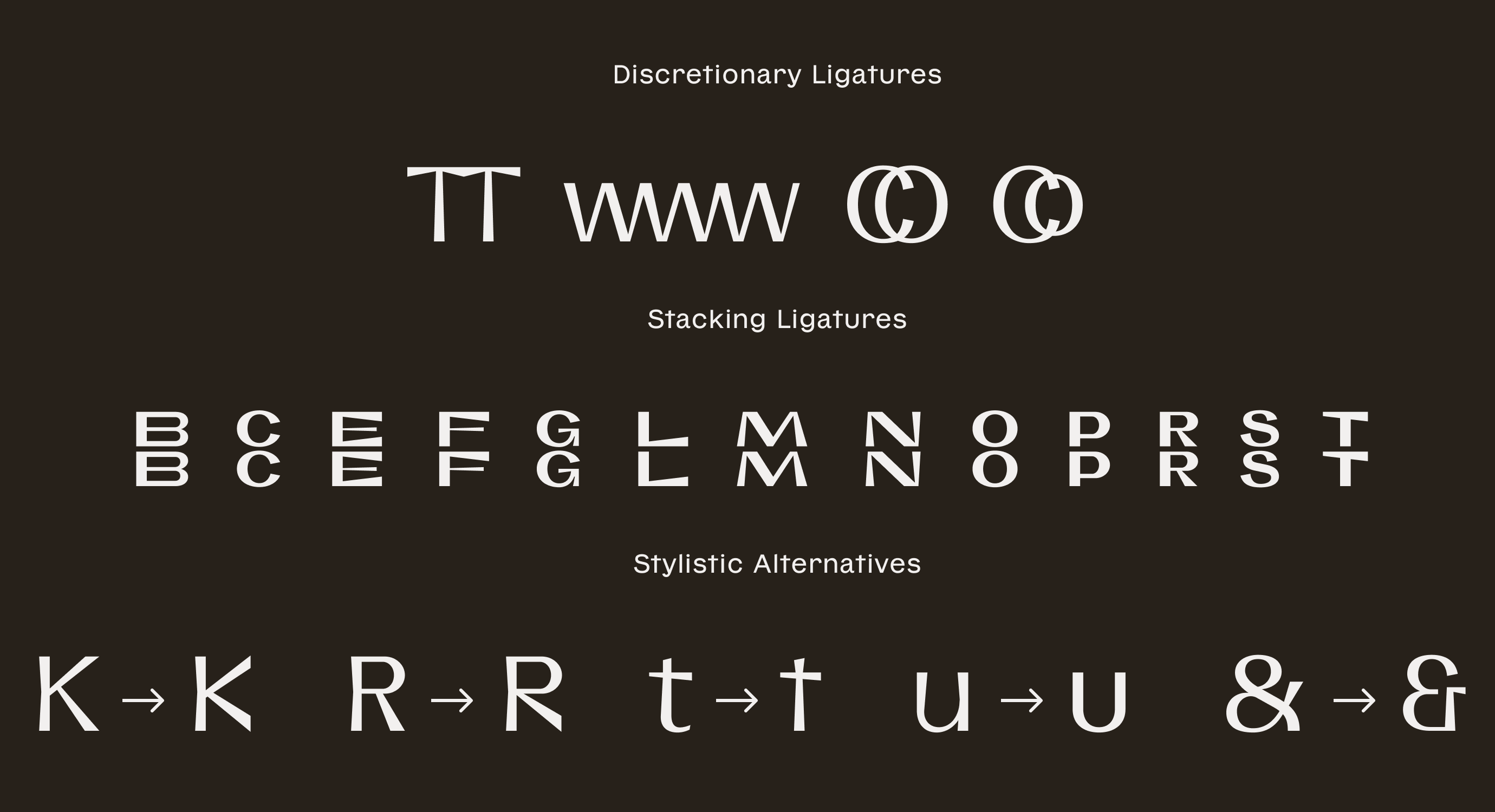

A plinth-shaped vertical form representing growth from a strong foundation is the basis for a new custom type family for the experimental design studio, Studio Kër. Available in an expressive display style and readable text variation, the typefaces both include a curious set of ligatures which stack letterforms, representing the studio’s philosophy of building up. Read the full case study at Abbr. Projects.